Choosing a brick colour is rarely just a “colour” decision. The final look of a wall is shaped by brick tone + mortar colour + joint profile + natural light—and those factors can make the same brick read warmer, cooler, darker, lighter, smoother, or more textured on-site. UK Brick’s ranges are designed with that real-world outcome in mind, from expressive waterstruck textures through to long-format linear bricks that create refined horizontal shadow lines.
As the UK’s exclusive supplier of Randers Tegl products, our colour ranges are produced in family-owned facilities in Germany and Denmark, where traditional craftsmanship is combined with modern production controls—helping deliver consistent colour, texture and performance from batch to batch.
Shortlist 2–3 brick colours that suit your architecture and setting. Decide mortar with the brick (not afterwards), because mortar tone can make bricks appear darker/richer or lighter, shifting the whole wall. Then approve the combination with a sample panel viewed in different light conditions before final specification.
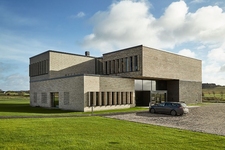
Brick is often the largest visible material on an elevation, so colour sets the tone: whether a façade feels crisp and contemporary, warm and familiar, or bold and architectural. UK Brick’s range spans classic reds through to whites, greys, blacks, browns, greens and softer tones—so you can select a palette that supports the design intent rather than fighting it.
For contemporary projects, neutral palettes (greys, blacks, whites, sands and buffs) are frequently chosen to sit comfortably alongside modern materials like glass and metal. Where you want a more graphic, strongly horizontal elevation, long-format linear brickwork pushes that aesthetic further by reducing the frequency of horizontal mortar lines and creating longer uninterrupted courses. UK Brick’s linear bricks are produced in 468 × 108 × 38 mm, giving an intentionally elongated proportion and a refined “linear” read.

Before you pick “the one”, it helps to understand why brick colour can look different from a small sample or a screen image.
A north-facing elevation can read cooler and flatter; a south-facing elevation can feel warmer and show more texture. With waterstruck faces, light can emphasise surface expression as it rakes across the wall.
Mortar isn’t a minor detail. Industry guidance explains that mortar colour can materially change perception: darker mortar tends to make walling appear darker and can make bricks look deeper/richer; lighter mortar can make bricks appear lighter overall.
Joint profile affects how shadow sits on the wall and how clearly the bond reads. UK Brick’s own guidance highlights how mortar colour, joint profile and bond work together—particularly on textured bricks—because they influence whether the façade reads as intentional and refined.
Long-format bricks change the “visual cadence” of a wall: fewer perpend joints per metre and longer horizontal runs. If the design intent depends on clean lines, small inconsistencies in jointing and alignment become more visible—so sample panels and workmanship benchmarks matter more.
Use the sections below to jump to the colour family you’re considering, then explore the full range on the dedicated colour pages:
These are practical “when to use it” notes for the most common colour directions. Each section ends with a clear next step: visit the relevant colour hub and review bricks in that range.
Red brick remains popular because it works across new builds, extensions and refurbishments without feeling overly “designed”. UK Brick’s red category includes options that range from classic warmth to more blended, character-led tones. Mortar choice can completely change the result: a lighter mortar can brighten and soften; a darker mortar can deepen and enrich.
Next: Explore Reds.
Buff and sand tones are ideal when you want warmth without the intensity of a red façade. They suit contemporary homes and light, minimal schemes and can also work well for extensions where you want a fresh finish that still feels “natural”. With lighter colour families, daylight conditions can shift the read more than people expect—so confirm with samples and a small panel rather than relying on one small piece.
Next: Browse Buff options in the full range navigation.
Brown brickwork can feel richly architectural without becoming harsh. It pairs naturally with timber, dark metalwork and muted greys—useful for contemporary residential and commercial design where you want depth and calm. Decide early whether you want the bond to read strongly: contrasting mortar can emphasise joint rhythm, while a closer match can create a calmer plane.
Next: Browse Browns in the full range navigation.
Grey brick is a go-to for modern façades because it’s composed and flexible alongside other materials. UK Brick’s grey-led palettes are often chosen for a calm finish with natural variation—useful when you want depth without a loud colour statement. Greys can swing cool or warm depending on light and mortar tone, so sample panels are the safest way to avoid surprises.
Next: Browse Greys in the full range navigation.
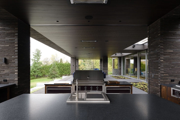
Black brickwork is often used to create contrast—against glazing, lighter cladding, or minimal landscaping. In long-format applications, black can produce a particularly striking horizontal emphasis because the coursing reads as a strong graphic element. UK Brick describes linear bricks as suitable for both external façades and interior feature walls, giving designers a consistent material language across spaces.
Next: Explore the linear brick range (and black options within it).
White bricks can deliver a clean, minimal finish that feels contemporary and premium—especially with crisp detailing. Because white is visually unforgiving, mortar colour and joint profile have an outsized impact on the final read. If the façade depends on a “clean” look, approve the combination with a sample panel under real site lighting.
Next: Explore Whites.
Green brickwork can be a statement choice, often used where you want something outside the typical neutral spectrum. It tends to work best with simplified detailing and a mortar decision that supports the overall tone rather than competing with it. As with any strong colour direction, confirm the final result with a panel—especially because lighting can shift how green reads across elevations.
Next: Explore Greens.
If you want the brick to be the hero, mortar needs to support the decision.
Use this simple approach in early-stage reviews, then test it with a panel:
UK Brick’s design guidance puts mortar colour and joint profile alongside bond and light interaction for exactly this reason: these choices determine whether textured brickwork reads as intentional.
To reduce risk (and avoid costly change requests later), treat colour selection as a short, deliberate process.
UK Brick recommends thinking beyond the brick itself—mortars, bond, joint profile, and how natural light interacts with the surface.
This is the point of sample testing: you’re not guessing from a screen image—you’re approving the wall you want to build.
Start with the overall palette: contemporary design often uses neutral tones that pair well with modern materials. If you want stronger horizontal emphasis, consider a long-format linear brick for extended visual continuity.
Yes. Mortar tone can shift the perceived colour of the whole wall. Dark mortar tends to make the wall read darker and can make bricks appear richer; lighter mortar can make bricks appear lighter.
If appearance matters (and it usually does), sample panels are one of the simplest ways to confirm the real-world outcome. UK Brick specifically highlights how mortar, bond and light interaction can define the character of the façade.
UK Brick notes linear bricks are widely used for interior feature walls as well as external façades, supporting a consistent material language across spaces.
Bricks are fired clay products, and surface expression and colour variation can be part of the intended aesthetic—especially with textured faces. UK Brick notes imagery is indicative and that appearance can vary with production and weathering.
Shortlist colours close to the existing building, then test mortar and joint profile with a panel under your site lighting. Mortar tone can materially shift the final read, so it’s worth testing early.